- chapter 9 Hybrid Devices
- section 9.1 Abstraction — software as if hardware doesn’t matter
- section 9.2 The limits of hardware abstraction
- figure 9.3 Etch-a-Sketch
- section 9.3 Specialisation — computer-embedded devices
- section 9.4 What does it do?
- figure 9.4 Pepper grinder
- section 9.5 Mapping
- figure 9.5 Cooker hob knobs — note picture above each to attempt to clarify mapping
- figure 9.6 . (i) power socket switches have clear physical correspondence, but (ii) what do these light switches do?
- figure 9.7 Microwave oven control panel
- box 9.1 Why are software scroll bars on the right-hand side of the screen?
- figure 9.8 The Augurscope II, stand-mounted and hand-held (from [BS05])
- figure 9.9 Overlaps and gaps identified by the framework (adapted from [BS05])
- section 9.6 Feedback
- section 9.7 The device unplugged
- figure 9.11 (i) a nice mirror (ii) buttons to push and (iii) slide the phone in and out
- subsection 9.7.1 Exposed state
- figure 9.12 light switch: two states — visible even when the light bulb is broken
- figure 9.13 Exposed state devices
- subsection 9.7.2 Hidden state
- figure 9.14 Volume knob on CD player — no visible state
- box 9.3 A physicality approach to infusion pumps — some thoughts
- figure 9.15 (i) dishwasher with exposed state, out=off, in=on (ii) TV hidden state push-back button
- figure 9.16 Computer on/off button: hidden state with power light
- subsection 9.7.3 Tangible transitions and tension states
- subsection 9.7.4 Natural inverse
9.1 Abstraction — software as if hardware doesn’t matter
The computer being used to write this chapter is a laptop with a trackpad. The awkward angles needed to use the trackpad continuously lead to pains in the wrist and hands, so there is also a wireless mouse. However, when swapping between mouse and trackpad there is no need to change software, the same word processor works equally well with both. If this seems unsurprising to you, think again how different a mouse and trackpad are. It is like going to a restaurant and being given a fork instead of a soup spoon. Even more amazing, the same web pages you can use on the laptop with mouse or trackpad can also be used on the phone, clicking links using your finger alone.
Now this seems so obvious you need to really step back to realise it is surprising at all. However, things were not always this way and the identification of abstract devices was crucial to the development of the modern user interface.
Early terminals had keyboards, so there was an easy first abstraction, text entry, as all had the basic alphabet and numbers. However, even here there were numerous differences, from plain keyboards to those with special keys for a particular function. Cursor keys came slowly, so early software often had different mappings from keys and key combinations to actions. Nowadays this is virtually obsolete, partly due to keyboard standardisation and partly to increasing reliance on the mouse (or trackpad!), but its remnants can still be seen in the slightly different key mappings of Mac and Windows software.
The origins of the mouse date back to the early 1960s with Douglas Engelbart‘s innovative Augmentation Research Center. While the mouse was used in the very first Macintosh computer in 1984, it was in fact some time before it became more widely used in personal computers, largely because most did not have graphical windows-based user interfaces but instead were based on character maps.
Fig. 9.1 Douglas Engelbart’s first mouse
Michael Hicks (CC BY 2.0): https://commons.wikimedia.org/wiki/File:Douglas_Engelbart%27s_prototype_mouse_-_Computer_History_Museum.jpg
However, before the desktop computer had become commonplace there were a variety of high-end graphical workstations for use in specialised areas such as CAD and scientific visualisation. These often needed some way to draw and to select lines and areas on screen, but they varied tremendously in the devices used to achieve this. Some had light pens which could be used to touch points on the screen directly, or draw on the screen as if it were paper. Others used tablets with ‘pucks’, a bit like a mouse except that the position of the puck on the tablet mapped directly to a position on the screen, whereas with the mouse it is only the movement that matters. Some CAD workstations had small joysticks, or two small thumbwheels: one controlling horizontal ‘x’ location and one for the vertical ‘y’ location.
This variety of hardware did not matter when computers were so specialised that software and hardware were delivered together as a package. However, in the late 1960s and early 1970s those working in computer graphics began to look for more generic ways to describe and build interactive graphical software, and identified a number of key functions, all of which could be achieved using a combination of a keyboard and some form of pointing device [Ne68;Wa76]. Low-level software converted the varying signals generated by the different forms of pointing device into a uniform digital format. By the time the current windows-based operating systems (X/Linux, macOS, Windows) were developed, they all had generic ‘mouse’ devices, which in fact can be just about anything that generates an x–y coordinate and has the means to select through pressing a button or otherwise.
This abstraction away from hardware has been incredibly successful, and because of it, when laptops appeared that used alternative devices instead of the mouse — trackballs, keyboard nipples and trackpads — there was no need to develop new software, just a ‘driver’ for the new device that made it appear to the software the same as the mouse. Likewise, direct screen devices such as styli on tablets or direct finger touch interactions are ‘just like a mouse’ to the word processor or web browser with which you are interacting.
This process has continued as radically new hardware capabilities have appeared. For example, both Mac OS X and Windows now provide the programmer with generic scroll wheel events. Multi-touch devices, such as the iPhone, that use two-finger gestures have proved challenging, since two fingers are definitely not the same as two mice (and anyway how many systems use two mice!). Apple, providing both software and hardware, were in a similar position to early graphics workstation manufacturers, able to tune the software to particular hardware characteristics, whereas Microsoft wished to provide a variant of Windows that could run on any multi-touch hardware and so had to work out new abstractions over the common features [WM09].
9.2 The limits of hardware abstraction
It would be very surprising in a book about physicality if we ended up saying the precise nature of hardware doesn’t matter. Abstractions are both theoretically elegant and practically useful, and the importance and utility of suitable ways to abstract away from the specificity of devices should not be underestimated. However, there are limitations: a mouse is not the same as a trackpad (if it were there would be no reason to buy a mouse to go with the laptop), and phone keypads, TV remotes, and washing machine controls are not all the same.
Very early on in the quest for abstractions over keyboards and pointing devices, there were voices who warned about these limitations. Bill Buxton was one of these. He pointed out differences in both the intrinsic capabilities of the then popular pointing devices and also in the ease with which different devices could be used for specific tasks.
For the first of these, the intrinsic capabilities, Buxton showed that pointing devices differ even at a very abstract level. He distinguished three states [Bu90]:
- State 0 — no tracking, no pointer shown on screen; e.g. a light pen or touchscreen when the pen or finger is far from the screen.
- State 1 — tracking, pointer shown on screen, but just to show you where it is; e.g. a mouse when no buttons are pressed.
- State 2 — dragging, pointer shown and something happening such as a window being moved, or a line being drawn; e.g. a mouse when the button is held down.
A mouse is only ever in States 1 or 2, whereas the light pens available at the time could have all three states: not in contact with the screen, so no tracking; in contact with the screen and tracking; and in contact with the screen with the button pressed for dragging. Of course you can lift a mouse off the table, but this simply leaves the cursor on the screen where it is, whereas if you lift your finger off the screen and then down somewhere else, the ‘pointer’ jumps to the new position.
In fact this particular difference is not too much of a problem. Most applications are designed for the mouse, and the light pen had more capability than the mouse, so unless the programmer did not deal well with sudden jumps in mouse position, all was well.
More problematic is that many touchscreens, both stylus based and finger based, only operate in States 0 and 2. When you are not in contact with the screen there is no detection of location, and when you are in contact it is treated as a ‘selection’. There is an argument that State 1 is only needed because the mouse is an indirect device, moved on the table top to affect the screen. You don’t need State 1 with the stylus as you can see where it is on the screen. However, State 1 allows pixel-precision positioning of the mouse cursor, whereas with touch-based interfaces fine positioning is very difficult (the ‘fat finger’ problem).
There are ways round this. For example, the iPhone adds an extra layer of interaction: if you touch and move, it is treated as State 2 dragging, but if you touch and stay still, a small magnified view is shown and movement treated as State 1 with the lifting of the finger acting as selection. However, this allows no way to perform a drag action with pixel-level accuracy for the start and end points, so the text applications all have text selections where the end points can be individually dragged.
Even when devices are capable of the same things, it does not mean they are equivalent to use. Buxton showed this by comparing children’s drawing toys. Like the early CAD workstations, Etch-a-Sketch has separate knobs for horizontal and vertical movement (see Fig. 9.3). This makes it really easy to draw the sides of a rectangle, but hard to draw a smooth diagonal line or circle. The mouse of course has the opposite characteristics, fine for any movement, but without the precision of separate x–y controls. Indeed, in a drawing program you may have found yourself sizing boxes by separately dragging the side and top edges (x or y one at a time) instead of the corner, or using text entry boxes to give precise x and y coordinates.

Even the mouse itself differs considerably between brands. The earliest mice often had the buttons on the sides or end whereas most modern mice have buttons on the top (or in the case of the Apple mouse the whole top surface). This is fine when clicking or dragging for short distances. However, if you need to drag, say, an icon across a large display, you may have to pick up the mouse to scroll the whole distance. Doing this while gripping a button at the side or end is fine, but it is almost impossible while pushing down on the mouse button. It is worth mentioning that early Macs had very small displays, so this issue did not arise.
Such differences between devices affect performance. In Chapter 5, we described Fitts’ Law, which predicts how long it takes to make positioning movements with a pointing device.
time = A + B log ( distance / size )
While any single device tends to follow the logarithmic law when comparing different distances and sizes of target, between devices the constants A and B can differ markedly, and this is used as the basis of the ISO 9241 standard to measure ‘non-keyboard’ devices.
The differences are even more important when considering specialised tasks. Many computer artists prefer to use a tablet and pen instead of a mouse, as the combination of the angle you hold the pen and the fact that there is a direct mapping between location on the tablet and screen location makes it seem more ‘natural’, more like a real pencil or brush.
It is also significant, not least when comparing different ‘equivalent’ devices, that some have different ergonomic characteristics. The reason for using an additional mouse with the laptop is to alleviate the muscle and joint strain of relying solely on the laptop trackpad.
9.3 Specialisation — computer-embedded devices
While it is possible to regard computers as pretty much similar, the same cannot be said for kitchen appliances. The controls for a cooker, washing machine, dishwasher, microwave and food mixer all look different, with specialised dials and buttons for particular functions. Because the computer is ‘general purpose’ it has a one-size-fits-all collection of devices (mouse, keyboard, screen), whereas more specialised consumer goods have controls designed specifically for purpose.
There is still a level of similarity, with individual controls on each device having recognisable buttons and dials. However, the number of controls and the way they are laid out are individual and special. The computer uses a single physical device (the mouse or trackpad) and makes it serve many purposes, often by showing virtual ‘buttons’ on the screen. Larger consumer appliances are more likely have several buttons or dials each with a single or small number of functions. Furthermore, even the dials differ: some can be moved continuously within some range, others have a number of ‘clicks’ relating to the number of options they control.
While dials and buttons are generic, there are sometimes very special controls designed for a particular purpose, such as the steering wheel on a car. These may have a seemingly arbitrary connection to the function they perform. For example, the gear stick on a car has a particular form due to the mechanics of the gear box, but for the ordinary driver that is just the way it is. See Chapter 19 for more about physicality and car controls.
Other controls, however, are intimately connected with the act of using the device, for example the food mixer that turns on when you press down on it, or the digital scales that automatically turn on when you step on them. The latter can be particularly intuitive, to the extent that the user may not even think ‘now I’m turning this on’; it just happens at the right moment. Volkswagen-built sat navs usually show an uncluttered screen, but when a user moves to interact with it, a proximity sensor triggers to reveal a set of options. Most users don’t even notice!
Sometimes users are completely unaware of the carefully designed-in functions of a particular set of controls. When Steve was building the kitchen we saw in Box 1.1 he installed a new dishwasher. The dishwasher was of the ‘integrated’ type –- designed to be hidden behind a panel — so the controls were mounted on the top edge of the door. Once it was all plumbed in, Steve switched it on, only to find that it was completely unresponsive. The very sympathetic repair man had to explain to Steve that the countertop would normally hide the panel when the door was shut, so closing the door also switched off the panel.
9.4 What does it do?
It is easy to know what to do with a device that only has an on/off button, but when faced by dozens of buttons on a remote control it may not be so obvious. Cases where it is not evident that something can be controlled at all are equally difficult.

Figure 9.4 shows a pepper grinder. A hapless guest might spend some time trying to work out what to twist to get it to grind. In fact it is an electric grinder and the metal disk on top is not decoration, but a switch that turns on the motorized grinder and a small light to boot ((The grinder is part of a pair, pepper and salt, but the makers clearly forgot the effect salt has on electrical wires; the motor still works on the salt grinder, but its light has, alas, failed.)). This highlights that there are at least three things you need to know before you can even attempt to use a device:
- know what the device is capable of doing, its functionality
- know what controls are available to you
- know the mapping between the controls and the functions
The pepper grinder fails on both (2) and (3)!
The first of these may seem most fundamental, but in fact if you can grasp (2) it is often possible to work out (1) and (3) through experimentation, albeit with potential embarrassment or damage along the way — think of the consternation of ‘Q’ as James Bond playfully presses every button on the missile-packed sports car.
In fact we have encountered these issues already in the form of affordances. Just as the rock of a certain height affords sitting, so also the pepper pot affords grinding pepper; however, it may lack the perceptual affordance that tells you how to achieve that.
One might think these are only issues for the newcomer to the device, such as the house guest, but they can affect even frequent users. Alan was once giving a talk about physicality and using the light switches in the room in order to illustrate a point. They were the kind that you press and the light goes on, you press again and it goes off. To illustrate that the action of pressing the light is in fact two parts, press in and then release, he pushed the switch in and held it for a few moments while talking. To his surprise and that of the rest of the people in the room the lights began to dim. What had appeared to be a simple on/off switch was in fact a dimmer. What was particularly surprising was that none of the people at the talk, several of whom taught regularly in the room, knew of the extra functionality. A more traditional dimmer switch would use a rotating knob to control the internal electronics directly. The knob suggests that it controls something variable, and would make it more likely that the users of the room would have discovered the dimmer functionality for themselves.
Such problems are particularly common with those flat buttons where a thin plastic sheet covers a contact below, or which operate by touch alone. Because these are easy to clean they have advantages in public areas as well as parts of the home, such as the kitchen, where hands may be dirty. However, it is common to see people pressing the sign beside the button instead of the button itself, since both are flat, plastic, and covered by many previous people’s fingermarks. This is not helped by notices that say, ‘press here’!
We will return to item (2), ‘know what controls are available to you’, later in the chapter, but for now let’s assume you have some idea of what the device does, and can see what controls are available. You are then faced with problem (3): ‘what does what’, often called ‘mapping’.
9.5 Mapping
The mapping between physical controls and functions has been a point of interest since the earliest days of human–computer interaction research. One of Don Norman’s examples is the electric cooker. There are four dials and four rings, but which dial controls which ring? Often the controls are placed in a line on the front of the cooker or above on a separate panel. The two dials on the left control the left two rings, but what about back and front? Some cookers instead place the controls alongside the rings in a line from back to front — now it is not even obvious which is left and which right. Of course, the dials each have a little image beside them, intended to make this clear, but even if you can work out what they mean do you manage to do this quickly enough when the pan is about to boil over?

Physical placement helps users understand mapping. If controls are on or near the item they control then you at least know which device they apply to. You may sometimes get confused about which remote control is which, but you’re unlikely to go to the controls on front of the TV when you mean to turn on the HiFi. There are limits to proximity. The remote control may confuse you, but it saves you getting out of the chair. With the cooker, you could imagine having a separate dial for each ring placed right next to the ring, but of course you would burn yourself whenever you tried to use them.
Where the things that are being controlled have some form of physical layout, reflecting this in the controls themselves can help. For example, if there is a line of lights in a room, we can organise the light switches to be in the same order (see Fig. 9.6). With the cooker, we could imagine laying out the dials in a square to reflect the layout on the hotplate, but of course this would take more space than placing them in a line.


Fig. 9.6 . (i) power socket switches have clear physical correspondence, but (ii) what do these light switches do?
For more abstract functions, such as the time and power settings of a microwave oven, or channel and volume selection on a TV remote, there is no direct physical correspondence. However, physical appearance and layout can still help users to establish a mapping. Look at the microwave oven controls in Figure 9.7. Related controls have similar appearance and are grouped together.
Steve: I think I have some material on a remote control design which may be helpful here
There are also metaphorical positions associated with some concepts. Up, loud, large and forward are ‘positive’, so on a TV remote where there are arrow buttons for volume control we expect the upward pointing arrow to make the sound louder; for the channel selection up would increase the channel number and down decrease it.
Left and right are somewhat more complex. In a dextra-oriented society, right is usually the ‘positive’ direction, but this is complicated by reading order. In left-to-right languages such as European languages, the two agree, and in particular notices, images and controls that need to be read or operated in a sequence should flow left-to-right, but where the language flows right-to-left sequences will also flow in that direction.
Interestingly the top-to-bottom reading order of English and other languages also causes a conflict for temporal ordering. Is forward in time up or down? You will find examples of both being used for information display, but where you want someone to use a sequence of controls in a particular order, left-to-right and top-to-bottom reading order wins (for English and European languages).
The observant reader may notice another positioning conflict in the microwave controls in Figure 9.7. Along the bottom of the panel are three buttons, which add 10 minutes, 1 minute and 10 seconds respectively to the total cooking time — that is bigger to the left, the opposite to the general right=positive=bigger rule. However, this reflects the order that the digits are written in the display — when you write numbers it is the digit corresponding to the biggest unit that comes first.
Box 9.1 Why are software scroll bars on the right-hand side of the screen?
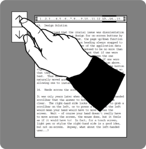
Think of the reason for using a scroll bar. You have a document or list and want to find something. So you scroll a bit, examining the document as you go until you find the required position in the text or list. Now consider your eye movement during this process. It is usually the first few characters or words that are significant in identifying whether you are at the right place. These occur on the left, so your eye has to scan constantly from the scroll bar on the right (which you are controlling with a mouse and thus need to look at) to the start of the text on the left.
Early scroll bars in the Smalltalk and Interlisp environments (the direct ancestors of our current WIMP interface) had user-configurable scroll bars, which could be made to appear either side. But the default and norm was on the left. Yet the Apple Lisa, then Macintosh, followed by almost all Windows interfaces, adopted Rank Xerox’s GlobalView, the Xerox Star desktop interface that had scroll bars on the right. So why did scroll bars start appearing on the right?
The right-hand side seems ‘right’ because for most users (those who are right-handed), to grab a scroll bar on the left or to press a button on the left would mean your hand would have to move across the screen. Of course your hand doesn’t really have to move across the screen, the mouse does, but it feels as if it would have to! But in fact, though for right-handed users of a touchscreen, light pen or stylus the right-hand side is a good idea, for users of a mouse pointer the left would be better.
So, as you design physical correspondences you need to be aware that there may be several potential correspondences and the one the user assumes may not be the one you intend. Where there is potential for confusion you can either:
(a) attempt to remove one of the ambiguous correspondences by repositioning controls; for example, putting time controls vertically rather than horizontally.
(b) increase the physical connection of one control so that it dominates; for example, placing time controls directly below a display to make the correspondence between digits on the display and the button order more obvious.
(c) add additional labels or other decoration to disambiguate; for example, make ‘mins’ and ‘secs’ a little more salient, though this shift from physical to symbolic may fail when users are stressed — just like the cooker control labels when the pan is boiling over.
(d) perform a user study to see whether one of the physical correspondences is the natural interpretation; in fact the time controls on the microwave appear to work without any errors, so in this case the digit order is clear.
Even if physical correspondences have not been explicitly designed, users will often perceive them. Recall the story of the fire alarm in Chapter 8. In that case the fire alarm button was next to the door. This is a sensible position for a fire alarm, but it is also where you normally expect a light switch to be.
All the examples so far have been of very ‘ordinary’ interfaces. However, the same issues arise when designing more innovative interactions. The ‘expected, sensed, and desired’ framework was developed as part of the Equator project in order to analyse and generate mappings in novel devices [BS05]. Figure 9.8 shows one device analysed, the Augurscope, which was used to view 3D virtual worlds. The user either pushes the small trolley or holds the detachable screen in their hands while walking around Nottingham Castle. When they point the screen at a location they see a reconstructed 3D view of what was there in the past.

The framework considers three things:
- expected — What actions is the user likely to perform on the device? For example, the device may be pointed in different directions, or used while walking around.
- sensed — What manipulations of the device can the sensors embedded in the device detect? The Augurscope was equipped with a GPS and an electronic compass (now common in mobile phones and other hand-held devices, but not at the time).
- desired — What functionality is wanted for the device? For example, the ability to look at the scene from different directions.
Having identified elements in these three categories one can use the analysis to look for potential matches, mismatches and opportunities. Figure 9.9 shows the space of possible overlaps and gaps between these categories.

In the centre are the things for which the device is already catering well: desired functionality for which there is an expected user action, which can be sensed using the existing sensors. The simple act of turning the device around fits in this area: if the user is looking in one direction and can see the historic reconstruction in that direction, it is natural to turn the device to face other ways. This can be sensed using the compass and so the desired functionality of exploring the 3D reconstruction is achieved.
Other parts of the framework suggest potential problems. On the right are things that are desired and sensed but not expected. The seminar room light switch we mentioned earlier is an example of this. Part of the desired functionality was to dim the lights and this was mapped onto holding the switch down; however, this was not an expected action for the user and so it remained undiscovered until Alan’s lecture.
is there an opportunity here (or somewhere close by to talk a bit about the light switches in our new building which adopt the physical form of a standard light switch but which are computer mediated and near impossible to operate…However, the framework can be used as an inspiration or to identify opportunities for design. At the bottom is desired functionality that is currently not supported at all in the device, while at the top are actions that are expected and sensed but for which there is no currently desired functionality: can the latter be used to offer ways of achieving the desired functionality? One of the desired, but not supported, features of the Augurscope was to explore caves beneath the castle grounds. The Augurscope permitted ‘flying’ above the ground (to see a bird’s eye view of an area) by tilting the Augurscope screen downwards, but while it may be expected that users might make the opposite upward movement and this could be sensed with the compass (top area), there was no desired function mapped to that movement. This suggests a potential way in which the unsupported cave-viewing functionality could be mapped onto the upward tilt, like ‘dropping’ into the ground, and then reversed by a downward tilt which would ‘fly’ back up to the surface.
9.6 Feedback
Feedback — letting the user know what has happened — has been another key issue since the earliest days of human–computer interaction. When you type on a proper keyboard you can hear that you have typed a key as you hear the sound it makes — the sound is natural feedback. However, in a noisy street you may not be able to hear this click of the key and so cash machines often make an additional loud beep for each key that you press. Without this feedback you may press the key again because you are unsure whether you really pressed it the first time. In some circumstances this may be fine, if the second press does nothing, or at least does no harm, but often pressing a key twice is not what is wanted at all.
In ‘The Design of Everyday Things’ [No98], Don Norman suggested that human action can be seen in terms of a seven-stage cycle. Four of the stages relate to the execution of an action: deciding what to do and doing it.
- Stage 1. establishing a goal or desired state of the world (e.g. have document secure)
- Stage 2. forming an intention to act (e.g. save the document)
- Stage 3. producing a sequence of actions (e.g. move mouse to ‘save’ button’ then click)
- Stage 4. executing the action (e.g. actually move hand and fingers)
These stages can be used to diagnose different kinds of problem. In particular, James Reason [Re90] distinguished two kinds of human error: 1) mistakes, where the user is trying to do the wrong thing and 2) slips, where the user is trying to do the right thing, but in some way fails to achieve it. The former are effectively failures in Stage 2 whereas the latter are failures in Stages 3 and 4.
However, it is the second part of the cycle which is of interest here, the three stages of evaluating an action: working out whether it did what was intended.
- Stage 5. perceiving the state of the world (e.g. see alert box ‘file already exists’)
- Stage 6. interpreting the perceived state (e.g. understanding the words)
- Stage 7. evaluating the resulting situation with respect to the goals and intentions (e.g. deciding that the document needs to be stored in a different place)
All these stages critically depend on feedback, having sufficient information available from the world (including a computer system or electronic device) to work out whether the right thing happened. As in the execution stages, failures can happen at different points. A small red light on the car dashboard may not be noticed at all (failure in Stage 5), or if noticed the driver may think it means the petrol is nearly empty whereas it in fact means the engine is seriously malfunctioning (failure in Stage 6).
Physical objects often create feedback naturally because of what they are: you lift a mug and you can feel its weight as it lifts off the table, drop it and you hear the crash as it hits the floor. However, with electronic and hybrid devices it is often necessary to add feedback explicitly for digital effects. For example, you do not hear the sound of an email squashing its way through the network cable, but software may add a sound effect.
Box 9.2 Physicality-based digital input
The Apple iPhone changed the way we use mobile phones. The multi-touch screen technology it embraced and the physical gestures used to control it have become virtually ubiquitous, so it is hard to recall that they were once revolutionary. Apple made it possible to input using physical gestures that map well onto our ‘natural’ sense of how the physical world works. Multi-touch screens allow us to utilise gestures from our real, physical world as human digital interaction methods. Thus we are able to zoom in on a picture by placing our thumb and forefinger on the screen and expanding the space between them, in a signal we might physically use in, say, a game of Charades to indicate expansion (in the Charades case of a word). The iPhone’s ability to accept the inputs of more than one touch at a time and to interpret the physical movement between touches into meaningful digital inputs transformed our ability to interact with a digital product in a physical sense, despite the lack of many of the tactile qualities we would usually associate with a satisfactory physical interaction with an artificial device.
https://www.flickr.com/photos/williamhook/38109880456/in/photostream/
Imagine you are about to make a call on a mobile phone and start to enter the number. You will experience several different forms of feedback:
- you feel the key being pressed;
- you hear a simulated key click sound;
- the number appears on the screen.
The first of these is connected purely with the physical device; you still feel it even if the battery is removed. The second is a simulated real sound, as if the physical keys made a noise, and the last is purely digital.
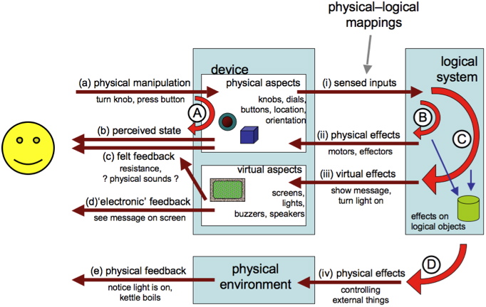
Figure 9.10 shows some of these feedback loops. Unless the user is implanted with a brain-reading device, all interactions with the machine start with some physical action (a). This could include making sounds, but here we will focus on bodily actions such as turning a knob, pressing a button, dragging a mouse. In many cases this physical action will have an effect on the device: the mouse button goes down, or the knob rotates and this gives rise to the most direct physical feedback loop (A) where you feel the movement (c) or see the effect on the physical device (b).
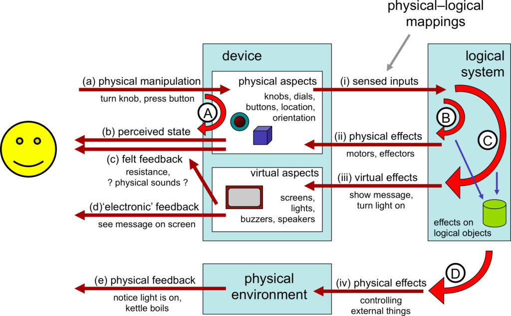
In order for there to be any digital effect on the underlying logical system the changes effected on the device through the user’s physical actions must be sensed (i). For example, a key press causes an electrical connection detected by the keyboard controller. This may give rise to a very immediate feedback associated with the device; for example, a simulated key click or an indicator light on an on/off switch (ii). In some cases this immediate loop (B) may be indistinguishable from actual physical feedback from the device (e.g. force feedback as in the BMW iDrive discussed in Chapter 2). In other cases, such as the on/off indicator light, it is clearly not a physical effect, but proximity in space and immediacy of effect may make it feel like part of the device.
Where the user is not aware of the difference between feedback intrinsic to the physical device and simulated feedback, we may regard this aspect of loop (B) as part of `the device’ and indistinguishable from (A). However, one has to be careful that this really is both instantaneous and reliable. For example, Alan often used to mistype on his old multi-tap mobile phone, hitting four instead of three taps for letters such as ‘c’ or ‘i’. After some experimentation it became obvious that this was because there was a short delay (a fraction of a second) between pressing a key and the simulated key-click. The delayed aural feedback was clearly more salient than the felt physical feedback and so interfered with the typing; effectively he counted clicks rather than presses. Switching the phone to silent significantly reduced typing errors. These interactions between visual and aural feedback can be quite complex; we will return to this in Chapter 20 when we discuss the McGurk Effect.
The sensed input (i) will also cause internal effects on the logical system, changing the internal state of logical objects; for a GUI interface this may be changed text, for an MP3 player a new track or increased volume. This change to the logical state then often causes a virtual effect (iii) on a visual or audible display; for example an LCD showing the track number (iii). When the user perceives these changes (d) we get a semantic feedback loop (C). In direct manipulation systems the aim is to make this loop so rapid that it feels just like a physical action on the virtual objects.
Finally, some systems affect the physical environment in more radical ways than changing screen content. For example, a washing machine starts to fill with water, or a light goes on. In addition there may be unintended physical feedback, for example, a disk starting up. These physical effects (iv) may then be perceived by the user (e) giving additional semantic feedback and so setting up a fourth feedback loop (D).
Frogger – feedforward9.7 The device unplugged
When something stops working, you might give it to a child as a plaything, if it is safe to do so. Or perhaps you are waiting for a bus and have a restless baby; you might give your phone to the baby to play with (after turning it off so that she does not accidentally call the police!).
With a smartphone the baby could perhaps use it as a mirror, feel the weight of it, look at its shininess. With an older phone, the baby might press buttons, perhaps open and close the lid (Fig. 9.11).
When we think of a device such as a phone, we quite rightly treat it as a whole, ‘I press this button and it dials a number’. However, as we started to see at the end of the last section, and as the playing baby demonstrates, the physical device has interaction potential even when unplugged, disconnected from its power and digital functionality.
Think of the phone without its battery, or tearing a central heating control off the wall and snipping its wires. What can you do with them? What do they suggest to you?
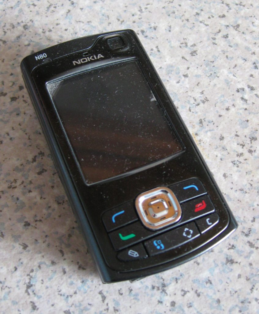
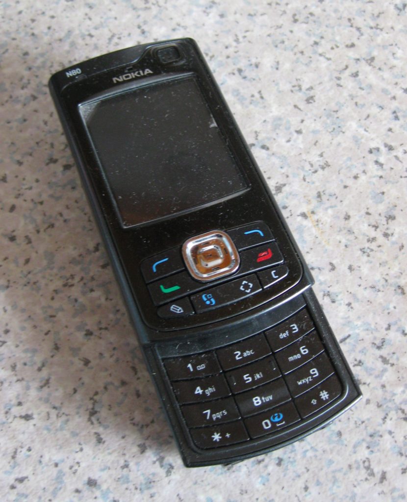
As the baby would discover, the iPhone on the left in Figure 9.10 has very little interaction potential without its power: there is one button at the bottom of the screen, and a few small buttons on its edge, all artfully placed so as not to obscure the clean lines of the phone. In contrast, the phone on the right has a variety of actions that can be performed, pressing buttons, sliding the keyboard in and out.
In the remainder of this chapter we will work through a number of examples of devices showing different kinds of interaction potential when unplugged, and discuss how these physical actions map onto the digital functionality. The ‘unplugged’ behaviour will in most cases be illustrated using a physigram, a diagrammatic way of formally describing physical behaviour [DG09;DG17]
9.7.1 Exposed state
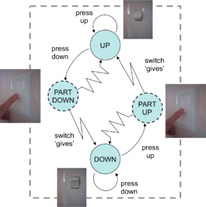
One of the simplest examples of a physical device is an on/off light switch. In this case the switch has exactly two states (up and down) and pressing the switch changes the state (Figure 9.12). Note that even this simple device has interaction potential; you can do things with it.
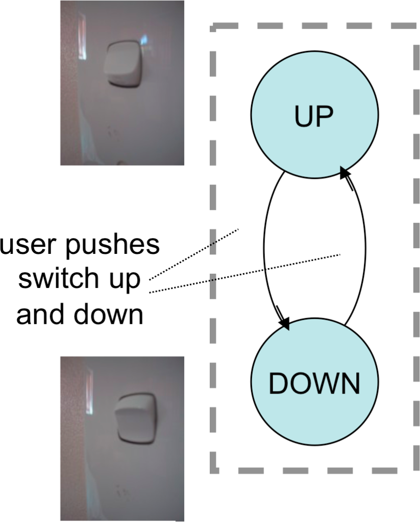
Even this is not so simple, since the kind of press you give the switch depends on whether it is up and you want to press it down, or down and you want to press it up. For most switches you will not even be aware of this difference because it is obvious which way to press the switch. It is obvious because the current state of the switch is immediately visible.
Note that the switch has a perceivable up/down state whether or not it is actually connected to a light and whether or not the light works — it has exposed state.
The phone in Figure 9.11 also has some exposed state in that you can see whether it is open or closed, but the buttons are not the kind that stay down. The iPhone has no exposed state at all. Here are some more exposed state devices (Figure 9.13).


The sockets are similar to the light switch except that the red colour on the top of the switch is also designed to give some indication of the mapping; this is known as feedforward. The washing machine control dial is more complex, but again it is immediately obvious by looking at the dial that it has many potential states. Like the power switch it also tries to provide feedforward through words and symbols around the dial. We will return to the washing machine dial later as it has a particularly interesting story to tell.
The central heating control is more like the mobile phone as it has a flap that moves up and down. Like the light switch, this means there are two very visually and tangibly obvious states: open and closed. However, this is a very particular form of exposed state as its effect is to hide or reveal other controls. In this case the purpose is to hide complexity, but it may also be used to protect against unintended actions — when the phone is closed it is impossible to accidentally dial a number. In the case of the phone there is of course yet another purpose, which is to change the form-factor: when closed the phone is smaller, to fit in your pocket or bag.
9.7.2 Hidden state
In contrast to these exposed state devices, consider this volume control on a CD player (Fig. 9.14). It has clear action potential, perceptual affordance: you can see that it sticks out, is round, it invites you to pull, push and, in particular given its roundness, twist it. However, remember the power is unplugged and so there is no sound (or imagine twisting it during a moment of silence between movements). There is no indication after you have twisted it of how far it turned. The washing machine and cooker knobs were styled and decorated so there was an obvious ‘I am pointing this way’ direction, but here there is no feedback. In fact, things have changed inside, but on the outside, nothing is detectable; it has hidden state.

Hidden state might be irritating on a music player, but there are occasions when it can have much more serious consequences (See box).
Box 9.3 A physicality approach to infusion pumps — some thoughts
In 2008 Harold Thimbleby [Th08] noted that the annual death toll from medical errors was roughly similar to the combined annual toll of car accidents, breast cancer and AIDS combined. He went on to describe a case study of an infusion pump that had caused at least one patient death. Thimbleby concentrates mostly on programming factors, but we would argue (and indeed Thimbleby suggests) that the pump’s physical design is an equally important factor. The accident in question involved a chemotherapy drug called diluted Fluorouracil. The bag’s label described the contents, the size of the dose and so on. In this case 5,250 mg of fluorouracil was to be diluted to 45.57 mg per mL and delivered over a four-day period. It was delivered 24 times too fast, killing the patient. While 2008 is some time ago, infusion pump designs at the time of writing nearly all still follow a very similar layout to the one Thimbleby inspected, with the key difference being larger, colour screens on a minority of models.
A catalogue of issues had led to the patient’s death, from failure to employ guidelines on how quantities should be notated, to problems with employing calculators to work out dosages (bear in mind that the context here is a hospital ward where a nurse making the calculations and programming the pump may well be interrupted, and where there may also be a lot of background noise and activity). Thimbleby identified several issues with the design of the pump itself (which will have had to pass a series of very strict ‘due diligence’ design exercises to be allowed into production). Among these issues was the ease with which a button that changed doses by single units could be confused with one that changed the dose by tens of units. Thimbleby also noted that computer-based medical devices such as this infusion pump are frequently rebooted when problems arise, at which point they lose previously stored data. It was at this point that many errors tended to happen.
Thimbleby developed an iPhone app designed to overcome the flaws in the processes involved in programming the machine, but there is no reason the device itself couldn’t be designed to reduce the potential for error. Could storing information via a device’s physicality offer potential design solutions in cases such as this?
In Chapter 7 we noted that computers appear to break some of the laws of the natural (physical) world where many of our gut level understandings and ‘instincts’ are rooted. As a quick reminder, those rules of thumb were:
1. directness of effort – Small effort produces small effects, large effort produces large effects.
2. locality of effect – The effects of actions occur where and when you physically initiate the action.
3. visibility of state – Physical objects have complex shape and texture, but this is largely static.
Just like the mobile phone in Chapter 7, our infusion pump breaks all of these physical world rules:
1. no directness of effort – One wrongly inputted digit (say a decimal point) and an effect can be multiplied 10 or 100 times.
2. no locality of effect – The whole purpose of an infusion pump is to supply a dosage over a period of time — temporal non‐locality.
3. no visibility of state – The infusion pump is full of hidden state. It has a small screen driven by buttons which must be used to interrogate the computer one function at a time (e.g. dosage and rate of delivery).
Could physicality be used to develop a more ‘natural’ interface? Consider the following suggestions for changing the traditional infusion pump arrangement:
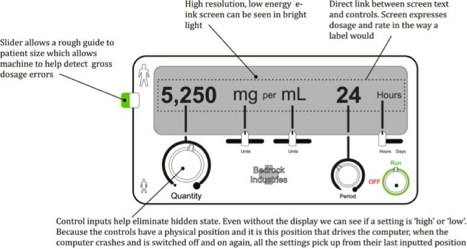
1. Use dials and sliders instead of buttons: these mechanical controls allow us to see a setting and judge if it is high or low (visibility of state). While there is no directness of effort as such with these controls, there is at least a correlation between effort and effect (e.g. to create 10 times the dose I have to turn the dial ten times as far). The fact that the controls are physical would mean that the pump can re-programme itself to its last setting in the event of a power cut or a reboot. This would remove a major and common risk area identified by Thimbleby.
2. Place the controls in the order that the nurse generally needs to input them (e.g. from left to right or from top to bottom). This should reduce user error by providing logical sequencing. Remember that this arrangement might vary according to culture (e.g. in Arabic countries it would seem natural to read from right to left).
3. Assign one control device per task: this creates a direct, visible and physical link between the control input and what it is controlling, removing hidden state.
4. The size or location of the controls can be used to denote their relative importance. This helps the user to concentrate their efforts where they are most critical.
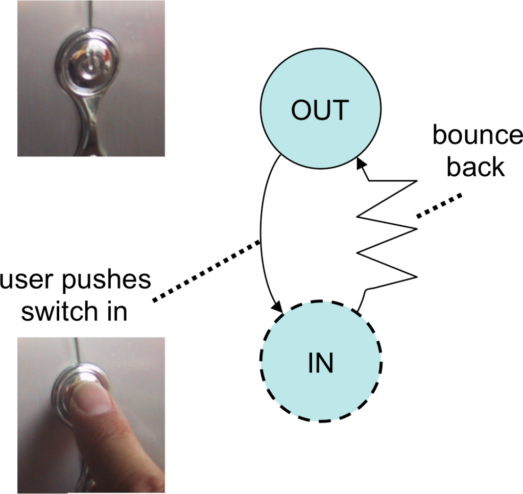
Another common example of hidden state is bounce-back buttons, such as often found for the on/off switches of computers. Consider the TV and dishwasher button in Fig. 9.15. Superficially they look similar, but when you interact with them their behaviours differ markedly. With the dishwasher button you press it and it stays in (in fact, this is the ‘on’ position when the power is on — see the little red light, the power was actually on when the photo was taken!). In other words it has exposed state. In contrast you press the TV button in and as soon as you let go the button bounces right back out again. Of course the TV turns on or off as you do this, but the button on its own tells you nothing; this is hidden state.


If this seems a minor thing, maybe you have had the experience when the TV screen is blank, but you don’t know why. Is it because it is off, because it is in standby, because you have just turned it on and it is warming up, or because the DVD player connected to it is off? In principle it is often possible to see, because small red LEDs are added — in this case you can see the LED next to the button labelled ‘STAND BY’. However, in reality, do you really look at all those little red lights or do you simply press a few buttons at random on the different boxes until something happens?
Maybe you have even lost data from your computer because you accidentally turned it off when it was in fact just sleeping? On many computers, both desktop and laptops, there is a single on/off button (Fig. 9.16). To turn it on you press it, to turn it off you press it, but it simply sits there looking the same. You open the laptop or look at the blank monitor (which itself may be because the computer is asleep or because the monitor is). Thinking the machine is off you press the power button to hear, too late, the little whirr of the disk starting to spin as it wakes from sleep, followed rapidly by the dull thud as it turns off and starts to reboot. What was onscreen before it went to sleep? Did you save the draft of that chapter on annoying hidden state buttons?
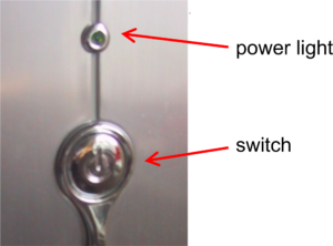
As you contemplate several hours’ lost work, you can take comfort in the fact that the designer has often foreseen the potential problem. In the photo above, you can see that this computer button, like the TV button earlier, has a small light so that you can see that the power is on, in this case a tiny green (unlabelled) LED. If you had been observant, if you had realised this is an indicator meaning ‘turned on’ rather than ‘connected to the power’, if you hadn’t got confused in the moment, then you could have worked out it was on and not lost all that work — small comfort indeed.
Now there are good reasons for using a bounce-back switch, which we will discuss in detail later, one of which is when the computer can also turn itself off through the software. However, these bounce-back buttons are often found on computers when this is not the case (indeed the one photographed in Fig. 9.16 does not have a software ‘off’) and an old fashioned up/down power switch might be more appropriate, or a switch which, like the dishwasher button, stays depressed when in the ‘on’ position. Even where the software can switch the power off, why not simply have an ‘on’ button and then an additional ’emergency off’ button for the cases when the software is not shutting down as it should? This could be small and recessed so it is not accidentally pressed, rather like a wristwatch button for setting the time.
Sometimes the reason for not doing this is lack of insight, and sometimes plain economics — the cents or pence it costs to add an extra button are worth more to the manufacturer than your lost work! However, often it is aesthetics: your lost work is weighed against the flawless smooth casing with its single iconic button. And if you think the designer made a poor choice, what do you think about when you buy a new computer? It is a brave designer who is willing to focus on the long-term benefit of users, which improves their life, rather than the immediate appearance that makes them buy the product. Are you brave enough? Or perhaps it is possible to achieve both aesthetics and safety. Certainly the additional small ’emergency off’ button could be located slightly out of sight (although not so hidden the user can’t find it!), or made into an essential part of the aesthetic of the device.
9.7.3 Tangible transitions and tension states
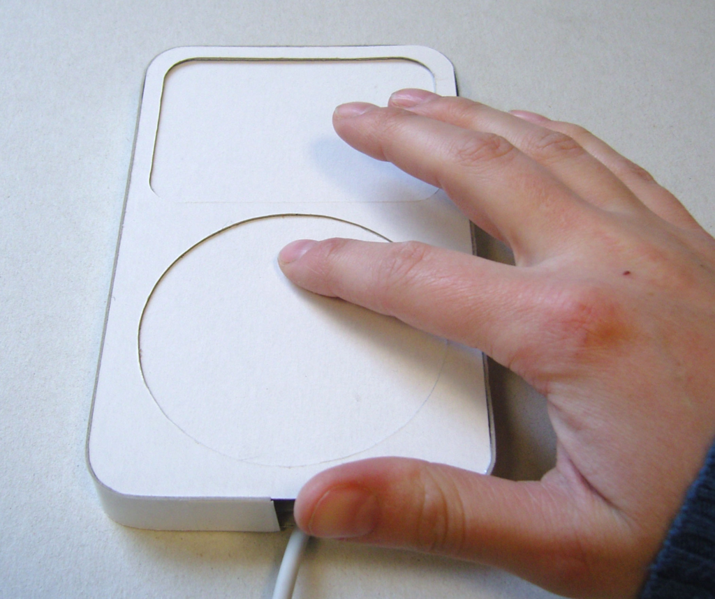
When you twist the CD knob shown in Figure 9.14 it is heavy to turn, giving it a feel of quality, but there is no sense of how far you have turned it. However, not all knobs and dials are like this.
Figure 9.17 shows three experimental prototypes that were produced for a photo viewer. All have an area where a small screen would go and all have a rotary control. The one on the left has a very obvious retro dial, the middle a more discreet dial, and the one on the right an iPod-like touch surface. In all the prototypes, rotating the dial enables the user to scroll between different menu options, although never more than seven at any level.
While they all use rotary controls, they feel very different in use. On the right the touch surface offers no resistance at all, your finger goes round, but without the display you cannot tell there is anything happening. In fact, it is perhaps only because one is used to devices like this that one would even try to stroke it — the cultural affordance of the iPod generation! In contrast the more clunky looking prototype on the left has a far richer repertoire of tangible feedback. It already has exposed state, since you can tell what direction it is pointing, and it also has end stops so that you can feel when it has got to one extreme or other of the menu. In addition, the mechanics of the mechanism mean that there is slight resistance as you move between its seven positions: it has tangible transitions between states.
Tangible transitions are particularly important when considering accessibility for people with impaired vision, or for occasions when you cannot look at the screen, such as when driving. The left-hand device has both end-stops and tangible transitions; this means that once someone has learned some of the menu layouts, the device can be used without looking at the screen at all. Even when you can see, the tangible transitions give additional feedback and the resistance between the positions makes it difficult to accidentally select the wrong option.
The device in the middle has a form of tangible transition: there is a very slight sensation as one moves between positions. However it has no end stops and there is no resistance before it moves to a new position. The lack of resistance makes errors more likely and the lack of end stops means it is harder to orient oneself except by looking at the screen, but at least it is possible to tell how many steps one has taken.
It is not only knobs that can have tangible transitions. The light and power switches we discussed earlier not only have a visible state, but there is definite resistance as you push the switch down: it gives a little, and then there is sudden movement as it flicks down. If you release the pressure of your finger before it flicks down, it simply bounces back to where it started. In a sense the device has at least four states; as well as the obvious up/down there are also part-up and part-down states as one pushes the switch, although only the up/down states are stable when you release your finger pressure.
Bounce-back buttons, such as the computer power button in Figure 9.18, can similarly be seen as actually having two states, out and in. Only the out state is stable, but while you press with your finger it remains in a pressed-in state. This is a tension state, one where you have to maintain a continuous effort in order to maintain the state. In the case of the computer power, the tension is never maintained, you just press and release. However, tension states are often used as part of interaction, for example, dragging with a mouse.
Keeping your hand or other muscles in tension can cause fatigue if continued for a long period, and it also affects accuracy and timing. Indeed, Fitts’ Law measurements show measurable differences in performance between ordinary mouse movement and dragging [MS91]. However, the advantage of a tension state is that you are very aware that you are in the middle of doing something. When typing it is possible to break partway through a sentence and leave it incomplete, but it is impossible to go away partway through dragging the mouse, you have to release the mouse button and end the drag. This can be particularly important in safety-critical situations, such as the use of the ‘dead man’s handle’ in trains.
9.7.4 Natural inverse
It’s the summer holidays, and you are driving down a small country lane where the sides of the lanes are high earth banks and the lanes themselves winding, narrow and with no room for cars to pass one another. The car is packed full with suitcases and tents, spades and swimming costumes, so you cannot even see out of the back window. Suddenly, round the bend ahead another car appears, coming towards you. You both stop; one of you must go back. There is a relatively straight part of the lane behind you with nowhere to pass, but you do recall passing a gateway just before the last bend, so you shift the gear into reverse and begin to edge backwards, with only your wing mirrors to see where you are going.
At first you drive very slowly, everything is back-to-front and unless you think very hard you turn the wheel in the wrong direction. However, after a bit you find yourself confidently driving backwards at a fair speed down the straight lane behind. Every so often you suddenly ‘lose’ it, end up getting too close to one of the banks and have to stop, and, as if from the beginning, work out which way to turn the wheel, but each time you quickly get back into the flow.
Even if you are a very experienced driver and find reversing is no longer difficult, maybe you have tried to reverse a trailer or caravan and had a similar experience.
It is reasonable that this is difficult if you are not used to reversing a car for long distances, but what is remarkable are the periods in between, when it becomes easy. It is not that you have learned the right thing to do, as you find that when you get out of the flow you have no better idea which way to turn the wheel than when you started.
The reason for these periods when reversing becomes easy is that the steering wheel exploits very basic human responses — the natural inverse. When you draw a line on paper and decide it is in the wrong place, you need to find the eraser and rub it out. It is not difficult, it is something you’ll do without thinking, but it is something you’ve had to learn. If, however, you are trying to put the pencil inside a desk-tidy and you move your hand a little too far to the right, you’ll automatically move it slightly to the left. In the world there are natural opposites, up/down, closer/further, left/right, and our body mirrors these with muscles and limbs hard-wired to exploit them.
Work by Rodolfo Llinás showed that some of this is very low-level indeed, with sets of mutually inhibitory neurons that allow pairs of opposing muscles to be connected [Li02, p.45]. Although higher-level brain functions determine which pairs operate, some of the actual control even happens in the spinal column, as is evident in the headless chicken that still runs around the farmyard. These paired muscle groups allow both rhythmic movement such as walking, and the isometric balancing of one muscle group against another that is needed to maintain a static position, such as holding a mug in mid-air.
When you first start to drive in reverse, you have to think to yourself, ‘if I want the car to move to the left which direction do I need to turn the wheel?’. However, when you have started to move the wheel and discover it is going in the wrong direction, or you are about to overshoot and go too far, you do not have to think again, you instinctively move it in the opposite direction (see also Box 9.4). The natural inverse takes over and you do the opposite of what you were doing before.
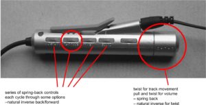
Unplugged devices often have buttons, knobs and other controls that have natural inverse actions: twist left/twist right, push/pull. The minidisk controller in Figure 9.19 was intended to be clipped onto clothing while the user was walking or running. Since it will be used eyes-free it is particularly important that the physical format helps make it easy to use. The device has two different kinds of control and both of them exhibit natural inverse.
On the end of the device is a knob. Twisting the knob in one direction moves on to the next track, twisting it in the other direction moves it back a track — natural inverse. The knob can also be pulled out and this changes its function: twisting it one way increases the volume, twisting it in the opposite direction turns the volume down. Note also that this is a tension state. It is obvious whether you are changing track or changing volume, not just from the immediate aural feedback, but also because the knob wants to spring back into place, and to adjust the volume requires continuous tension.
Along the side of the device are a number of spring-back sliders; they can be pushed forward or backward. Each slider controls a different function, but all of them use the same principle. There is an ordered list of options for each setting; pushing the slider moves between the relevant option settings one way through the list, pulling it back moves it the other way. Note that the natural inverse reduces the impact of mistakes. If you choose the wrong option and change it, you instinctively move the slider in the opposite direction and restore the setting.
Using the natural inverse can obviate the need for explicit ‘undo‘ operations, and can make a control usable even when you don’t know what it does. The phone in Figure 9.20 belonged to Alan some years ago. On the top left-hand side of the phone was a small slider. This slider did different things in different modes: when in a call it adjusted volume, when in the address book it scrolled through the names. Alan never knew exactly what it did, yet he used it extensively. This was because it always respected the natural inverse property and so he could use it without fear; if it didn’t do what he expected he just did the opposite movement and carried on.

Box 9.4 Why driving backwards is hard: expectation, magnification and control theory
Of course when you are driving using mirrors things are not really back-to-front. If, as you look in the mirror, you see the left-hand side a little too close to the bank, you turn the wheel to the right — this is exactly the same as when you are driving forwards. So if you could somehow ‘switch off’ the knowledge you are driving backwards and pretend that the mirror is really just a very small windscreen, things would be easier — however, we do not have the power to fool our own minds so easily!
The other difficult thing is that the wing mirrors are designed so that you can see the whole road behind in a tiny mirror, whereas the same portion of the road ahead fills the entire windscreen. Using the mirrors is a bit like driving forward looking through the wrong end of a telescope ((N.B. not to be attempted on the open road if you value your life!)).
Finally the mechanics of the steering work differently in reverse. Whether driving forward or backward, it is always the front wheels that turn. This makes it (in principle) easier to reverse into a narrow space, but makes the car much harder to drive backwards in a straight line. The front wheels of a car also have a small ‘toe in’: they point slightly together. This has the effect of making the car tend to stay in a straight line going forwards, but the opposite effect when driving backwards.
Chapter 5 discussed open and closed loop control; these are part of a wider area of mathematics called ‘Control Theory‘. One general principle in control theory is that there is always a trade-off between control and stability. For example a light beach ball is easy to control. You can roll it exactly where you want it, but it is unstable: the slightest breeze and it rolls away. In contrast a large cubic block of concrete is very stable, but boy is it hard to move where you want it. The forward and reverse movements of the car demonstrate different points in this trade-off: going forwards you have a high degree of stability, the car keeps on going in a relatively straight line unless you work hard to change direction, whereas in reverse the opposite is true, it is easy to control in the sense that you can manoeuvre into very tight spaces, but it is highly unstable.
Because digital and mechanical systems do not exhibit proportional effort (Chapter 7) it is possible to engineer situations that are at extreme points in this trade-off space. It is also occasionally possible to ‘break’ the trade-off, to have your cake and eat it. Modern fighter jets are deliberately designed to be unstable while flying, rather like the car driven in reverse. This allows very rapid movements when required, but makes them unflyable by a human pilot alone. However, the pilot’s control is augmented by very fast, automated systems, which constantly trim the aerofoils to keep the plane flying where it is intended to go.
References
1. [BS05] S. Benford, H. Schnädelbach, B. Koleva, R. Anastasi, S. Greenhalgh, T. Rodden, J. Green, A. Ghali, T. Pridmore, B. Gaver, A. Boucher, B. Walker, S. Pennington, A. Schmidt, H. Gellersen & A. Steed. Expected, sensed, and desired: A framework for designing sensing-based interaction (, ACM Transactions on Computer-Human Interaction, TOCHI, Volume 12 Issue 1, March 2005) [9.5;9.5;9.5]
2. [Bu90] Buxton, W. (1990). A Three-State Model of Graphical Input. In D. Diaper et al. (Eds), Human-Computer Interaction – INTERACT ’90. Amsterdam: Elsevier Science Publishers B.V. (North-Holland), 449-456. http://www.billbuxton.com/3state.html [9.2]
3. [DG09] A. Dix, M. Ghazali, S. Gill, J. Hare and D. Ramduny-Ellis (2009). Physigrams: Modelling Devices for Natural Interaction. Formal Aspects of Computing , Springer, 21(6):613-641, doi:10.1007/s00165-008-0099-y http://alandix.com/academic/papers/FAC-physical-2009/ [9.7]
4. [DG17] Alan Dix and Masitah Ghazali (2017). Physigrams: Modelling Physical Device Characteristics Interaction. Chapter 9 in The Handbook of Formal Methods in Human-Computer Interaction, Springer, pp.247–271. DOI: 10.1007/978-3-319-51838-1_9 [9.7]
5. [Li02] Rodolfo Llinás (2002). I of the Vortex: From Neurons to Self. MIT Press. [9.7.4]
6. [MS91] MacKenzie, I. S., Sellen, A., & Buxton, W. (1991). A comparison of input devices in elemental pointing and dragging tasks. Proceedings of the CHI `91 Conference on Human Factors in Computing Systems, pp. 161-166. New York: ACM. [9.7.3]
7. [Ne68] Newman, W. M. 1968. A system for interactive graphical programming. In Proceedings of the April 30–May 2, 1968, Spring Joint Computer Conference (Atlantic City, New Jersey, April 30 – May 02, 1968). AFIPS ’68 (Spring). ACM, New York, NY, 47-54. DOI= http://doi.acm.org/10.1145/1468075.1468083 [9.1]
8. [No98] Donald A. Norman, The Design of Everyday Things. MIT Press, 1998, ISBN-10: 0-262-64037-6 [9.6]
9. [Re90] Reason, James (1990): Human Error. New York, NY, Cambridge University Press [9.6]
10. [Th08] Thimbleby, H. (2008) ‘Ignorance of interaction programming is killing people’ ACM Interactions, Volume 15 Issue 5, September + October 2008ACM, New York, NY, USA [9.7.2]
11. [Wa76] Wallace, V. L. 1976. The semantics of graphic input devices. SIGGRAPH Comput. Graph. 10, 1 (May. 1976), 61-65. DOI= http://doi.acm.org/10.1145/957197.804734 [9.1]
12. [WM09] Jacob O. Wobbrock, Meredith Ringel Morris, and Andrew D. Wilson. 2009. User-defined gestures for surface computing. In Proceedings of the SIGCHI Conference on Human Factors in Computing Systems (CHI ’09). ACM, New York, NY, USA, 1083-1092. DOI: https://doi.org/10.1145/1518701.1518866 [9.1]