

Summary: Unlike most of the examples, which analyse existing devices, this is about the way product designers use physigrams during the prototyping phase of a new device. It also introduces some new ad hoc features, showing the way physigrams can be used as an extensible notation.
Most of the examples are of commercially produced devices that are already in operation. This example is about the use of physigrams in design and prototyping.
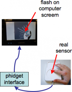
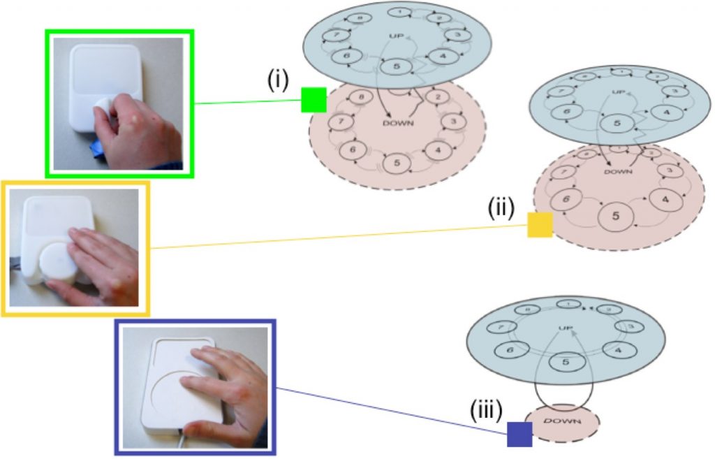
A group of product designers were considering three alternative designs for a new media controller. Each design was to have a small screen and a control that could select between a maximum of eight menu items. The device would be used to control different forms of menu system. The menu systems were being mocked up using a phidget to connect the prototype physical devices to their digital envisionments.
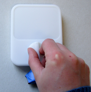
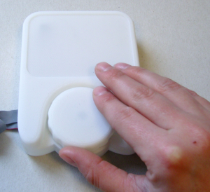
The core difference between the alternative designs was in the means of selecting between the eight menu choices. One was an almost retro-style knob with obvious direction. The second was a dial with less obvious direction, but clear physical movement. The third used a round touchpad sensor, similar to those found (at that stage) on some iPods.
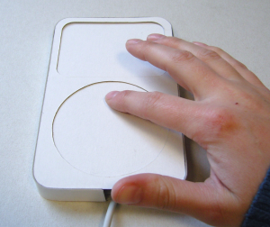
Note that the position of the knob in design (i) is clear, it has exposed state, whereas both (ii) and (iii) are hidden state devices.
The designers were given documentation on the physigram notation, with examples, and then created physigrams for their own designs. Whilst all the examples they were given were clearly flat diagrams, the designers created 3D-style versions, using the layout of the diagram to mimic the physical layout of the devices, with states in a circle, but also the press-down shown as two layers.
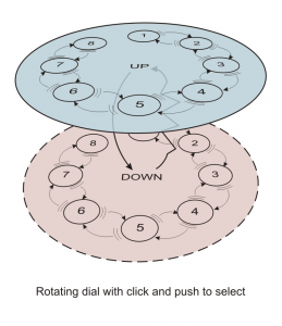
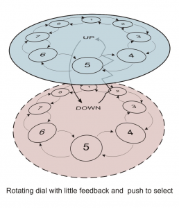
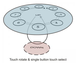
The most immediate difference is between the third design, the round touch surface, and the other two. In both of the other designs, when you press down the knob or dial it bounces back to the same position. In contrast, the touchpad is a relative movement of your finger: there is no ‘position’ to which it can bounce back after being pressed. Hence, while the other devices have multiple down states, the touchpad is depicted with an undifferentiated down state.
If you look a little more closely, in all cases the down state/states are shown as transient. The first two designs have a bounce back from the down state, as there is a tangible press and release. In contrast, pressing the touchpad produces no tangible feedback, so it is denoted by an arc going through the down state (unfelt bounce-back). This was a notational addition by the designers.
Arguably if there is no physical sensation or difference then they could have shown no down state at all: you press, but nothing seems to have changed. However, this would have resulted in the touchpad physigram ending up as a single undifferentiated state, which would have made a point, but without being helpful. Instead the designers depicted the states they ‘knew’ were there, but used extensions to the notation to show that really nothing is evident.
Looking at the up states, where the selection is made, the designs at first look similar, but the physigrams bring out crucial differences.
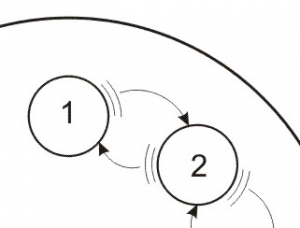
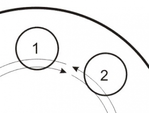
First, note that in design (i) there is no connection between states 1 and 8 – the knob has a hard physical stop at each end: you cannot rotate it 360 degrees. In contrast the dial for design (ii) and the touchpad in design (iii) allow you to cycle round and round. In terms of the 8-item menu, this means that the cursor would go off the bottom and back to the top. Note that the physical choice of device is making a very clear difference to the potential behaviour of the digital interface. Which of these behaviours is better is a matter of discussion, but the physigram makes it clear that there is a difference.
Looking in more detail at the transitions themselves, there are additional differences:
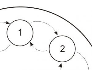
In the design (i), the knob has a very tangible resistance, and then give, for each stop; this is denoted using the give transitions back and forth between the states. In design (ii), the dial, there is a mildly tangible click as you pass across the 8 stops, but no sense of resistance; hence the transitions are denoted as plain transitions with no give. Finally, for design (iii), the trackpad, there is no feeling at all, you are simply stroking the surface; the only feedback is given by the digital display. Just as with the up–down states, this could arguably be presented as there being no differentiation between the states, but the designers instead decided to use a pass-through notation (slide transition) to show that you slide across where you know there is a transition, even though it is unfelt.
Note both designs (i) and (ii) have tangible transitions of different kinds, whereas (iii) has none.